VetWay is a groundbreaking digital infrastructure platform founded to solve one of the veterinary industry’s biggest challenges: fragmentation. Launched by a team of healthcare and technology experts, VetWay was born out of the need for a faster, more connected system to streamline communication between veterinarians, pharmacies, insurers, and PIMS. Its core mission is to eliminate inefficiencies caused by outdated workflows like faxes and phone calls, replacing them with a seamless, secure, always-on network. With features like ePrescribing, unified portals, and real-time data exchange, VetWay is redefining animal healthcare—turning disconnected systems into a high-speed ecosystem focused on care, efficiency, and innovation.
The creative brief was to develop a bold, future-forward brand identity for VetWay—the digital superhighway revolutionizing animal health. The brand needed to convey seamless connectivity, speed, and trust, solving the industry's core issue: a fragmented, outdated infrastructure. VetWay connects veterinarians, pharmacies, insurers, and platforms through a single, secure network. The branding should reflect innovation, clarity, and efficiency—positioning VetWay as the essential infrastructure powering the next era of veterinary care.
The Solution
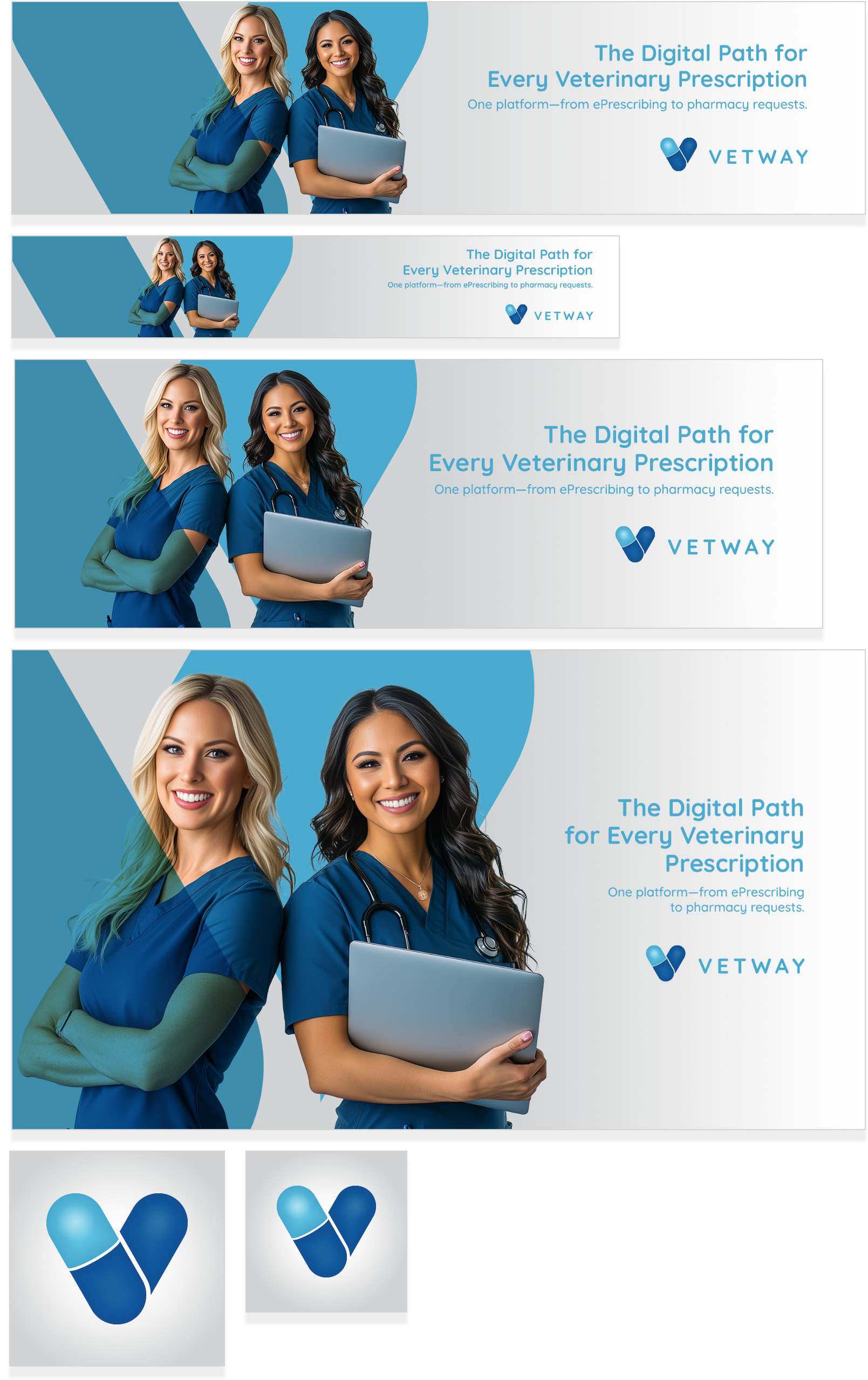
The solution centers on transforming the “V” in VetWay into a distinctive, modern brand mark by reimagining it as a stylized pill shape—symbolizing both veterinary care and pharmaceutical precision. This approach bridges VetWay’s dual role as a connector between medical providers and pharmacies. The pill-shaped “V” conveys clarity, trust, and innovation, while hinting at speed and direction, like an arrow pointing forward. Its sleek, simplified form ensures strong recognizability across digital and physical platforms. This mark becomes the visual shorthand for a seamless, high-speed network—capturing VetWay’s mission to modernize animal health through smart, connected infrastructure.
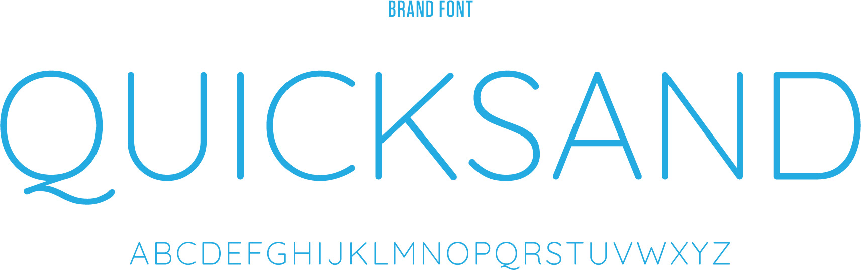
Brand Guidelines
The brand guidelines document was created to ensure consistency across all touchpoints, reflecting VetWay’s modern, connected identity. It outlines logo usage, color palette, typography, and visual tone, all built around the pill-shaped “V” mark. The guidelines empower partners to communicate VetWay’s mission with clarity, cohesion, and confidence.
Web Banners
Social media banners were designed for Facebook, LinkedIn, and Instagram to visually communicate VetWay’s mission and value. Using the bold pill-shaped “V” mark, clean typography, and dynamic layouts, each banner was tailored to its platform—ensuring brand consistency while optimizing for engagement, clarity, and professionalism across diverse audiences and devices.
Discarded Concepts
Several initial logo concepts were explored and discarded during development, including abstract network symbols, animal silhouettes, and medical cross integrations. While visually interesting, they lacked the simplicity, scalability, and immediate relevance of the final pill-shaped “V.” The chosen mark better captured VetWay’s identity as a seamless, connected healthcare solution.