Fruit Boom Beverages Ltd. was established in 2021 with a clear vision: to redefine the fruit soda category through bold flavour innovation and high-energy branding. Founded by a team of beverage industry professionals, Fruit Boom combines premium fruit extracts with finely tuned carbonation to deliver a refreshment experience that is both unique and memorable. Headquartered in London, the company is committed to quality, creativity, and consumer engagement. The flagship product line, known for its signature tagline “Explosive Fruit Energy,” is designed to appeal to a new generation of soda drinkers seeking excitement in every can.
The creative brief was to develop the branding for Fruit Boom, a bold new fruit soda brand targeting Gen Z and young millennials. The branding needed to be explosive, playful, and rebellious, capturing the essence of the tagline: “Explosive Fruit Energy” The goal was to create a high-impact identity with strong shelf presence, blending fun with a hint of danger. Three initial flavours—Strawberry, Orange, and Apple—were launched, each requiring a unique yet cohesive visual style. The brief included the development of a logo, flavour-specific designs, packaging, typography, colour systems, and a comprehensive visual style guide.
The Solution
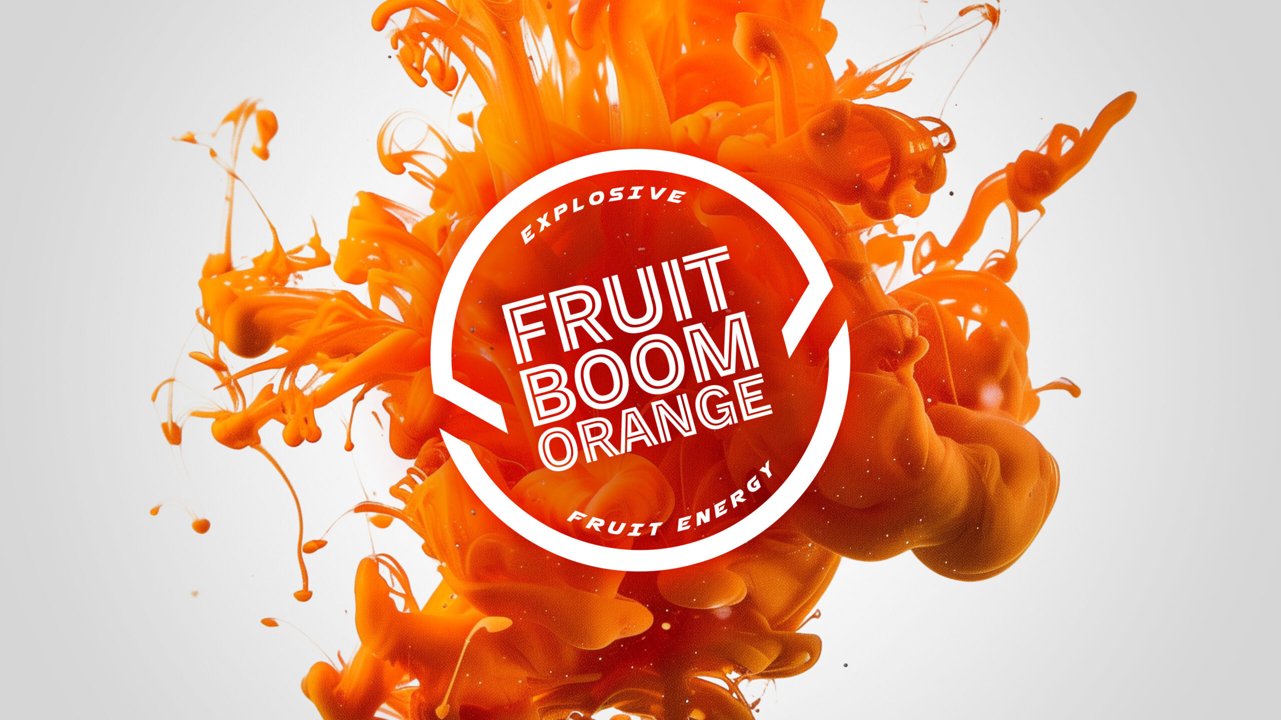
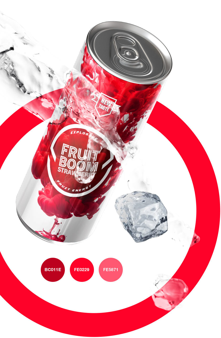
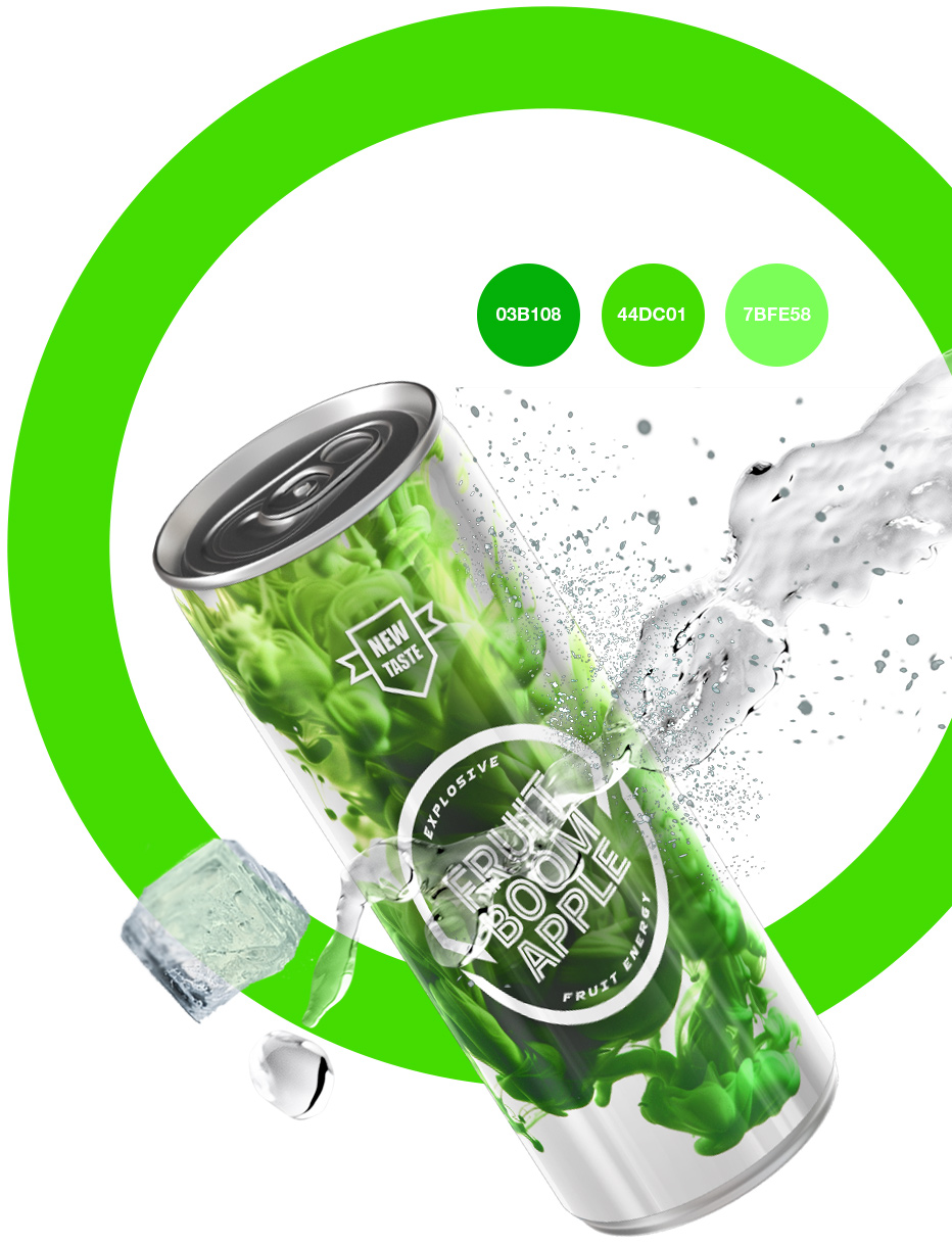
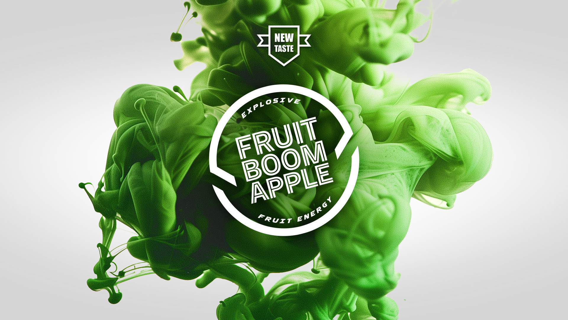
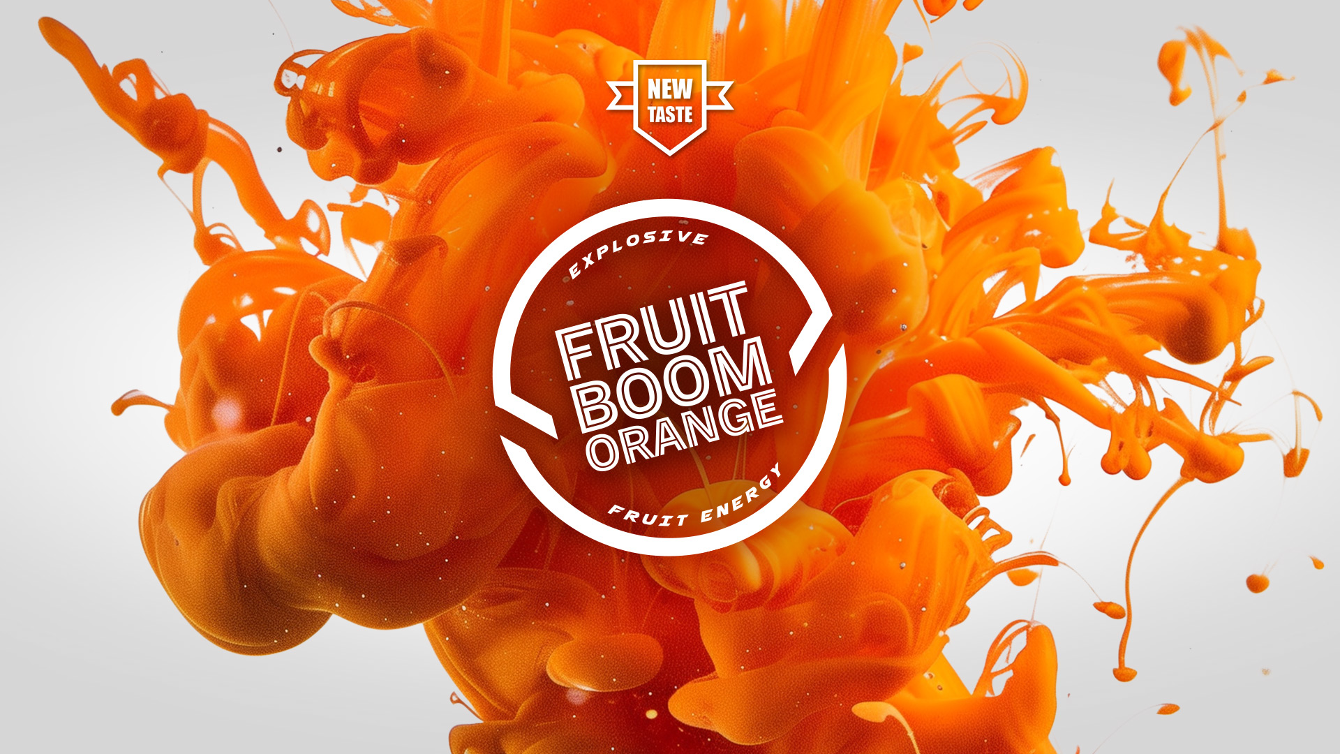
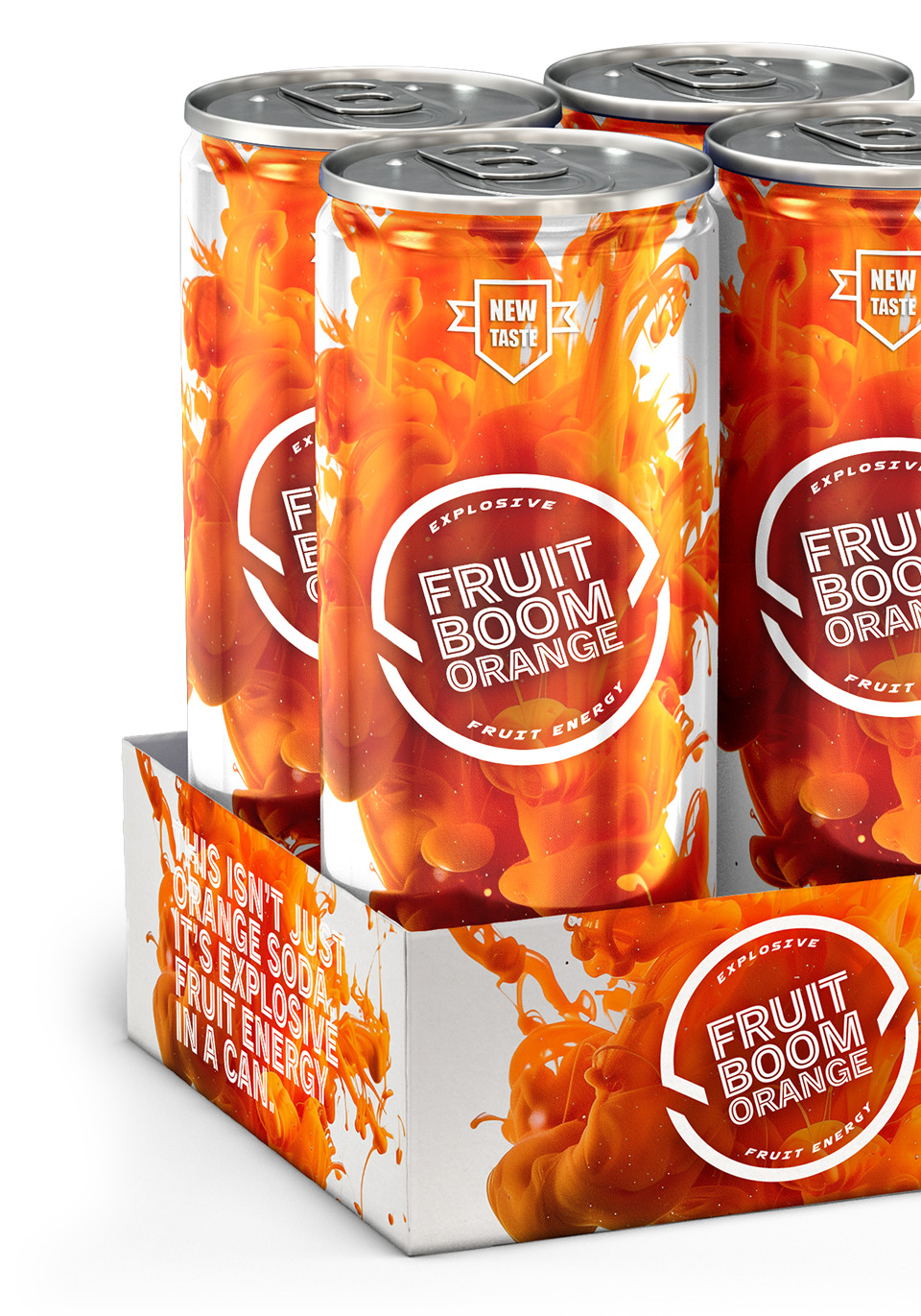
My solution was to position Fruit Boom as a bold, high-energy brand that delivers on its new tagline: “Explosive Fruit Energy.” I designed a custom logotype with a dynamic, energetic feel, paired with a vibrant, flavour-coded palette—electric red for Strawberry, bright orange for Orange, and neon green for Apple. Each can features bold typography, graphic bursts, and playful illustrations to reflect the brand’s energetic, fruit-fuelled personality. A comprehensive visual style guide was developed to ensure consistency across packaging, digital, and promotional touchpoints. The result is a visually striking identity that energizes the shelf and brings the brand's promise to life.
Key Visuals
The key visuals for Fruit Boom are designed to be bold, energetic, and instantly eye-catching. Each flavour features a dynamic explosion motif at its core, with fruit illustrations bursting outward to convey the brand’s signature “Explosive Fruit Energy.” Vibrant, high-contrast colour schemes—electric red, orange, and green—help differentiate the variants while maintaining brand cohesion. The use of comic-inspired bursts, motion lines, and layered textures creates a sense of movement and impact. Bold, playful typography is integrated into the design to amplify the energy and fun. Together, the visuals create a cohesive identity that grabs attention and reinforces the product’s high-energy promise.
We asked for "Wow".
We got "Wow"!
Ross is very detail oriented and super professional.
We were very impressed with everything he did for us.
JAMSMINA DUPONT - CO-FOUNDER & EXECUTIVE DIRECTOR | FRUIT BOOM
Output
Key Visuals
Logo Designs
Brand Guidelines
Stationery
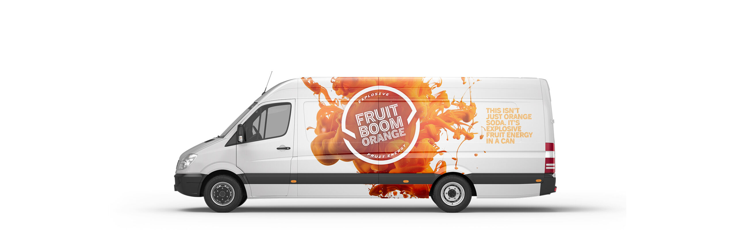
Vehicle Livery
+ Much More
My Role
Art Director
Graphic Designer
Technical Artist
Deployed
Website
Mobile App
Event
Social Media
OOH
Skills
3D Modelling
3D Texturing
UVW Mapping
Lighting
Rendering
Compositing
Drawing
Software
3DS Max
Vray
Substance Painter
After Effects
Photoshop
Illustrator
In Design